
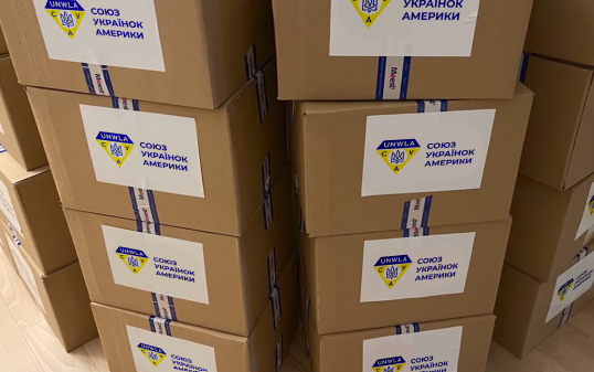
UNWLA - Brand Revival
THE CHALLENGE: The primary challenge for the UNWLA (Ukrainian National Women’s League of America) was to move from small‑scale aid to coordinating massive humanitarian pipelines and preserving Ukrainian culture. Their current visual identity feels outdated and makes it difficult to resonate with younger donors or modern international partners.
THE OBJECTIVE: UNWLA’s rebrand is to create a visual system that will help to empower the organization to communicate its mission clearly and professionally in a digital‑first environment.
ORIGINAL LOGO
The original logo carries a heavy history with traditional symbolism that needed to still be preserved in the new logo. It has served the organization since the 1920s but as UNWLA moves into high speed humanitarian advocacy, the goal isn’t to delete the history but to take it and translate it into a language that speaks to the next generation of donors and activists.
MOODBOARDS
The exploration for the UNWLA rebrand was through three distinct moodboards each designed to stress test the organizations identity against its current century long mission. We focused on traditional folk art, sophistication, and introduced an artisanal sisterhood.
SKETCHES
The initial sketches focused on rejuvenating the traditional Ukrainian Tryzub, finding a visual harmony between the historical diamond and a more contemporary aesthetic. By working with various line weights and curvatures, the sketches were able to explore more organic and script-like marks that feel more approachable. This process prioritized hierarchy to transform a dense emblem into a modern identity.
DIGITAL DRAFTS ROUND 1
Moving from the hand drawn sketches into digital vectors brings a much clearer sense of how these concepts will handle the typography. The digital translates sophistication and the move toward the rejuvenation that UNWLA wants. The results of the first round maintained a clear connection to the Ukrainian heritage while also adopting a refined modern aesthetic that would be suitable for global audiences.
DIGITAL DRAFTS ROUND 2
Following feedback, the second round of refinement focused on enhancing the visual weight of the brand mark. The UNWLA wordmark needed to be incorporated into a defined header within the diamond shape. This builds a clear typographic hierarchy and a more unified "seal". We also needed to frame the Tryzub inside of a circle, creating a central focal point. These were very important to maintain consistency with the organization's older audience as well as bringing a refined sophisticated approach for the future.
FINAL DESIGN
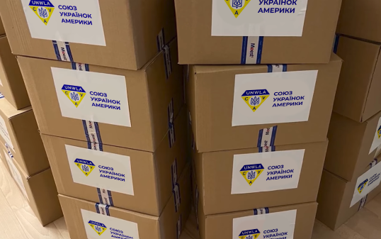
The final design of the rejuvenation expanded the core identity into a comprehensive system, grounding the organization's four pillars of service. A secondary iconographic set was developed to represent Advocacy, Education, Care, and Cultivation. This utilized Ukraine's rich history in embroidery and geometric structure to ensure brand cohesion. This system's approach allowed for the creation of a specialized sub‑brand like the UNWLA Book Club, with a more playful illustrative mark while maintaining the primary color palette.
The resulting brand system is both highly functional and deeply symbolic. The project was met with high praise for its ability to humanize the brand's mission through the four pillars iconography and cohesive branding. Ultimately, the revival enforces the UNWLA status and ensures the visual identity is as resilient and dynamic as the women it represents.
A special thank you to the UNWLA leadership and team for their invaluable feedback and trust throughout the process. It has truly been an honor to contribute to the visual legacy of such a vital organization.
TEAM MEMBERS:
Haley Foor