
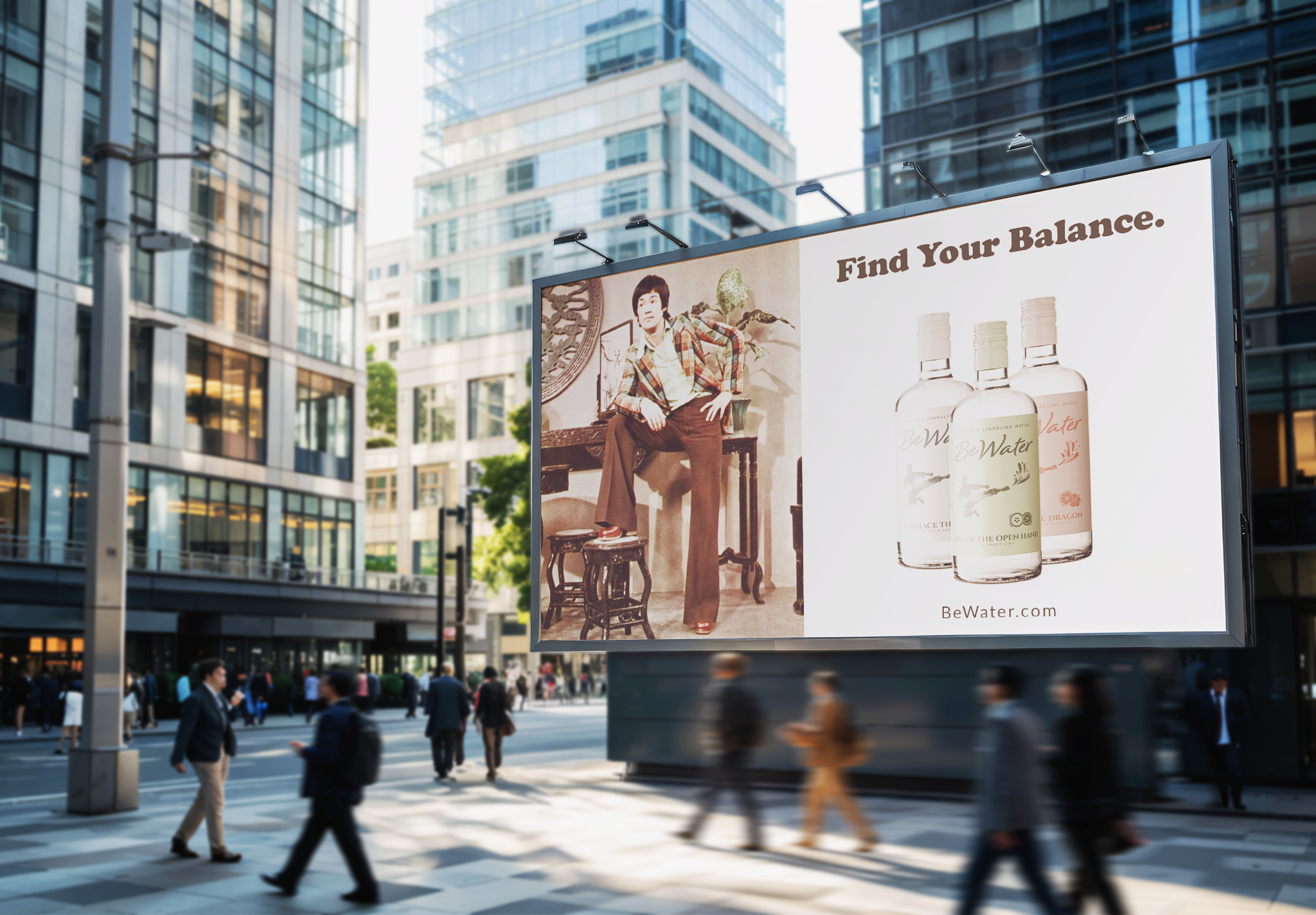
Be Water: Premium Sparkling Water Brand Identity
THE CHALLENGE: For this project was to reconcile the philosophical roots of the brand with the high energy, competitive landscape of the premium beverage market. While the Be Water concept demands a sense of Zen like tranquility and clarity, the product must also stand out on a crowded shelf against established sparkling water giants.
THE OBJECTIVE: Be Water needed to be a premium brand identity that transforms a simple beverage into a lifestyle philosophy. The goal was to create a cohesive visual system, spanning from packaging to environmental presence that resonates on an emotional level, offering consumers a sense of clarity and modern cool that stands out in a saturated market.
MOODBOARDS
The moodboards explore a duality between tranquil mindfulness and vibrant retro energy, merging two distinct visual worlds to define the brands premium identity. “Watercolor Chic” leans into the fluid philosophy of Zen through soft gradients and organic brushwork that evokes a sense of clarity and balance. The “70s Peace” brings in a nostalgic pulse using bold ribbon lines, psychedelic type and sun drenched tones that captures the spirit of the era.
SKETCHES
The sketching phase involved an expansive exploration of symbols that could represent both physical fluidity and disciplined strength. These range from organic wave forms and minimalist droplets to more structured icons like the lotus, yin yang, and even monograms. A significant portion I focused on the human movement and liquid dynamics, experimenting with how a strike or a silhouette can mirror the natural flow of water.
DIGITAL DRAFTS ROUND 1
In the digital phase, the focus shifted to refining the brands iconography and establishing a clear hierarchy for the packaging systems. These explore the tension between soft, flowing scripts and structured, bold typography, while testing how the primary symbols translate to a label format. From the organic yin yang droplet and the hand cupped balance symbols to high energy illustrations of impact like the fist or the flying kick.
DIGITAL DRAFTS ROUND 2
The second round of digital refinement, the concepts evolved into high energy pop art aesthetics that emphasize movement and impact. These versions move away from traditional minimalism and instead uses vibrant colors to create a sense of intensity and refreshments. I wanted to experiment with a unified mark and also dynamic silhouette with a splash. I also incorporated a tagline alongside a structured layout of nutritional facts and icons bringing the whole design to meet the technical requirements of modern beverage packaging.
FLAVOR PROFILES
The brand identity is fully realized through three flavor systems paired with a unique philosophical subtitle and a color coordinated design. By maintaining consistent placement for a silhouette and Be Water script, and technical data, the labels create a strong family of products that feel unified yet distinct on a shelf.
FINAL DESIGN
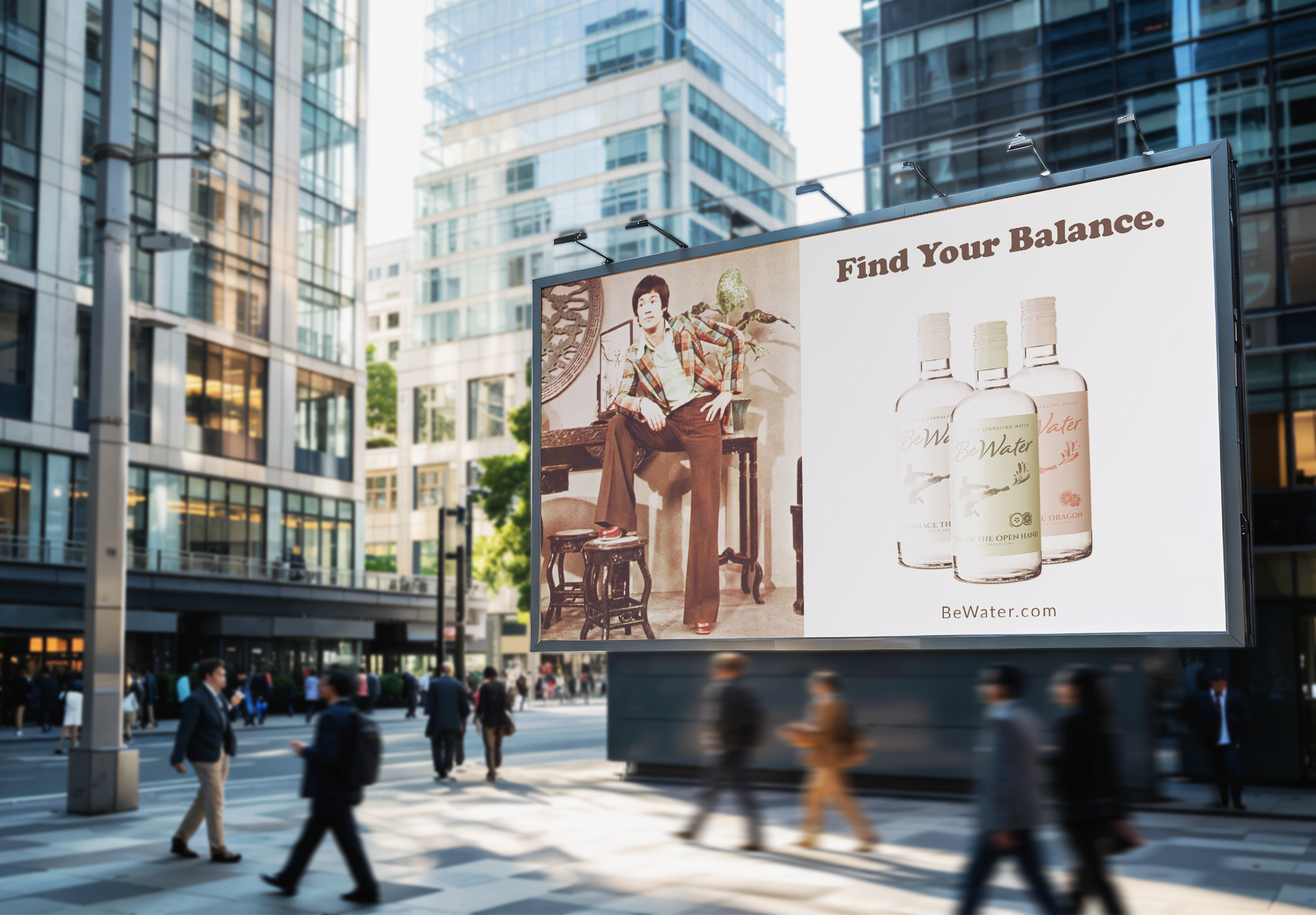
This project was all about finding the sweet spot between a grounded philosophy and the cool aesthetics of the 1970s. I wanted Be Water to feel like more than just another bottle on a shelf but feel like a mindset. The final design uses textured canvas like finish and a monochromatic look for each flavor, the goal was to make the packaging feel as refreshing as the water inside.
Bringing all the ads together was the most rewarding part. Seeing the brand start to feel alive mixing vintage photography with modern taglines, really shows how this brand can cut through the noise.