
Seoul City Branding & Wayfinding Strategy
THE CHALLENGE: Seoul is a modern global hub defined by a unique tension between its ancient heritage and its status as a "smart city" leader. The primary challenge was to create a city's multifaceted identity into a minimalist, high‑contrast visual system. This required creating a brand that felt authentically Korean yet remained universally legible while reducing the noise often found in urban environments.
THE OBJECTIVE: The goal of this project was to develop a cohesive, human‑centric wayfinding and branding strategy for seamless navigation for both residents and tourists.
MOODBOARDS
This project was about finding a balance between Seoul, a high‑energy metropolis, and the Seoul with traditional roots. By starting a deep dive into traditional colors and the beauty of Korean architecture, I was able to focus on what truly matters: clear and intentional communication. This fusion allows for a system that maintains the functionality required for wayfinding while preserving the organic soul that defines Korea.
SKETCHES
By mapping out a grid of brand attributes against the physical pillars of Seoul, I was able to move past the obvious and find the essentials. These sketches represent a deliberate editing process that stripped away complex details until only the most functional and iconic shapes remained. I also worked through dozens of iterations of a brand mark for Seoul; I explored fluid curves, traditional calligraphy, and rigid geometric lines. This allowed me to find a mark that carries the weight of Seoul's history while functioning as a clear and modern balanced form.
DIGITAL DRAFTS
Moving into the digital space, I focused on refining the typographic personality of the brand. These illustrations explore two paths, a fluid‑like brush‑inspired script that honors Korea's calligraphic heritage and a rigid architectural block system that mirrors the city’s modern infrastructure. These explorations are able to test the final logotype to ensure legibility and impact whether it was scaled down for web pages or blown up for an environmental banner.
FINAL DESIGN
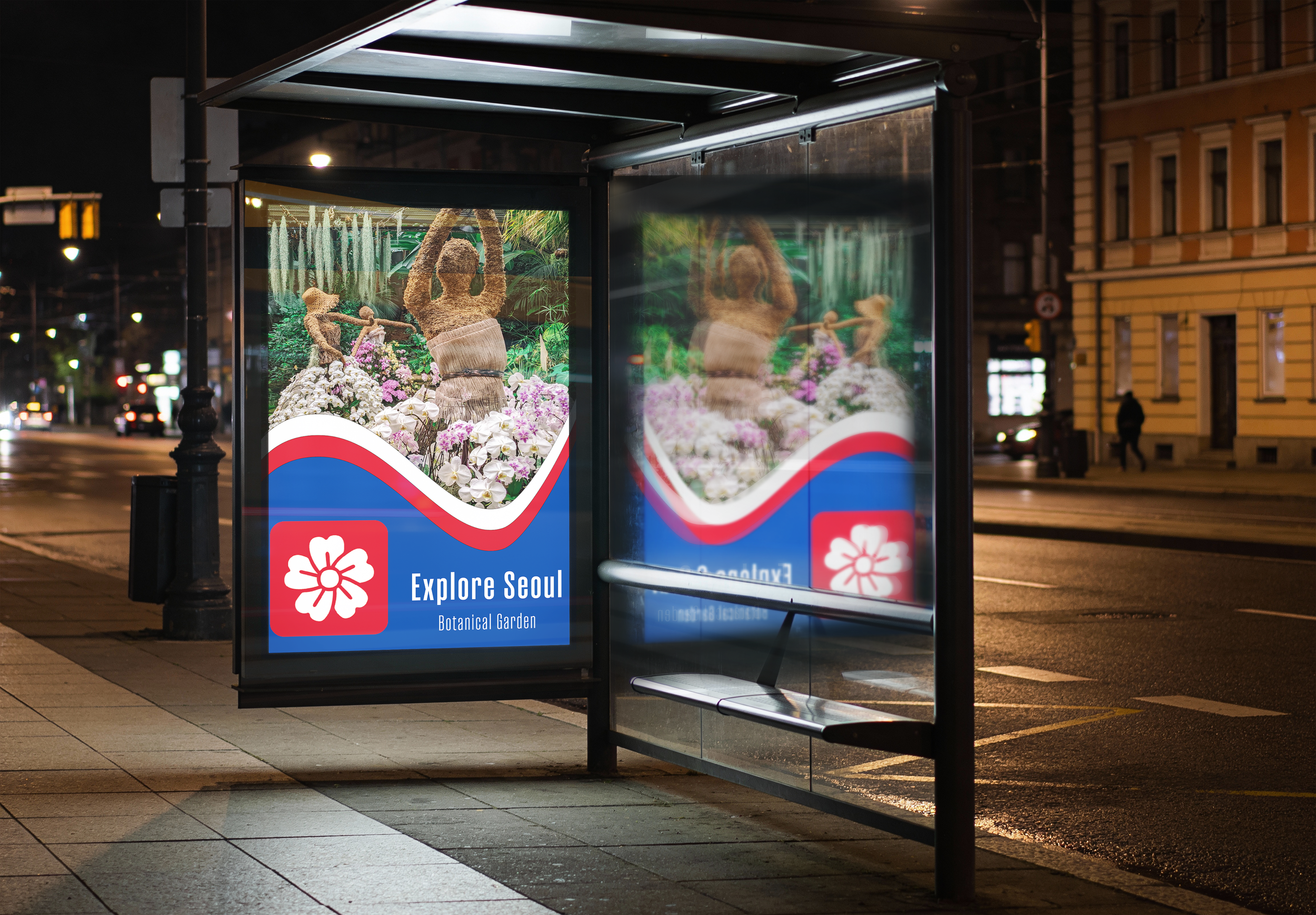
The final design is a living system that moves with the user from digital landing pages to the physical streets of the city. By applying a consistent rhythmic curve and high‑contrasting color palettes that represent South Korea’s flag across multiple touchpoints, the brand creates a sense of familiarity and ease in a complex urban environment. This isn’t just about a static logo; it’s a functional tool for navigation and respecting the quiet beauty of Seoul’s heritage while embracing the future of Seoul as a leader in innovation. The result is a cohesive experience that feels intentional and accessible.