
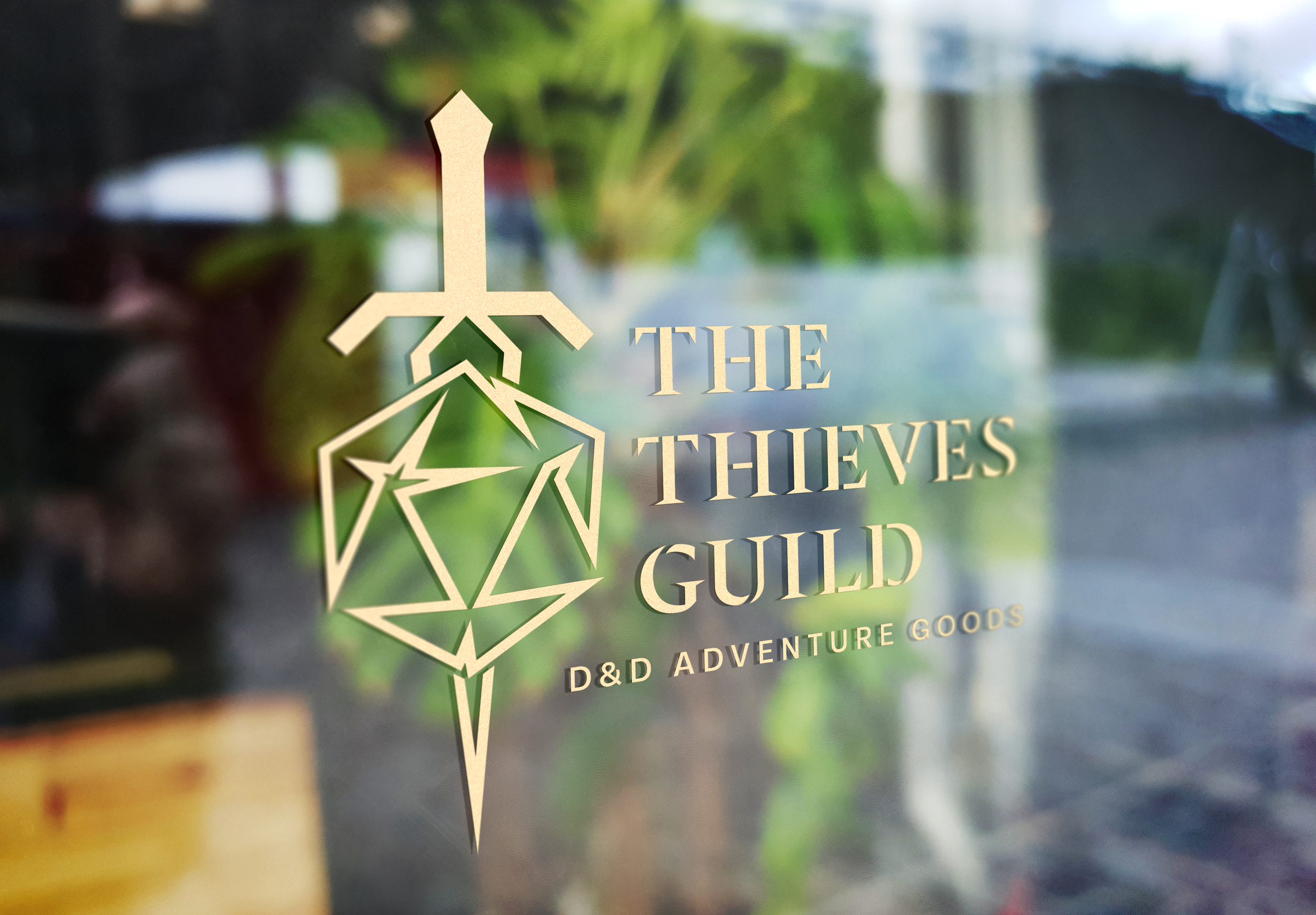
The Thieves Guild: Rebrand Identity & Immersive Retail Concept of Rogues Gallery
THE CHALLENGE: Most fantasy branding gets stuck in the past, using tired out tropes like burnt edges and messy scrolls. My goal was to break that mold and build a brand for a legendary Thieves Guild that felt sophisticated and intentional, not just gritty. The real test was balancing an identity with hidden, high stakes culture that only its members understand. Creating a brand that can hide in plain sight.
THE OBJECTIVE: The goal was to create a sense of elite belonging. Using clean iconography and tactile elements that function as an invitation to those in the know. By blending functional design with the atmosphere of D&D, I wanted to turn a street gang into a prestigious legacy. Every mark and texture is a piece of a larger story, designed to make the guild feel less like a cliche and more like an exclusive, clandestine society.
CURRENT LOGO
The original identity relied on a static, distressed aesthetic that reflected a traditional retail hobby shop, however to capture the immersive, narrative driven essence of a modern tabletop gaming sanctuary, the brand requires a shift toward a visual system that prioritizes momentum and world building over simple commerce.
MOODBOARDS
This rebrand draws inspiration from the dual nature of modern tabletop gaming, the high stakes precision of legendary combat and whimsical wonder of world building.
SKETCHES
The initial sketch phase focused on deconstructing the Rogues Gallery identity. By exploring the duality between sharp, calculated movement of the rogue and the lush, atmospheric world building fantasy exploration. The goal was to find a mark that balances the grit of a dungeon crawl with the inviting whimsy of a collaborative story.
DIGITAL DRAFTS ROUND 1
I focused on building a visual toolkit rather than a single logo, moving away from fantasy cliches to create a suite of intentional artifacts. By developing pillars like the branded D20, the minimalist blade, and the arcane "Mage Hand," I established a modular system that feels authentic to a high stakes D&D environment. These digital drafts also explored a spectrum of deep colors, like rust, navy, and sea blue, to show how different crews within the guild might maintain their own identity while remaining part of the same prestigious legacy.
DIGITAL DRAFTS ROUND 2
In this round, I began refining the face of the brand by pairing the Rogues Gallery wordmark with clean, intentional typography and tagline variations like "books & games”. I experimented with more illustrative marks, like the masked blade and the hooded figure, to find a balance between a high end storefront and its hidden guild roots. The goal was to test how the brand's earthy color palette and sharp geometry would translate to a professional identity that feels both established in a fantasy world and modern in its execution.
DIGITAL DRAFTS ROUND 3
The second phase of digital refinement pivots towards a sleek fusion of the shops core elements, specifically modernizing the iconic D20 and its relationship with the wordmark.
FINAL DESIGN
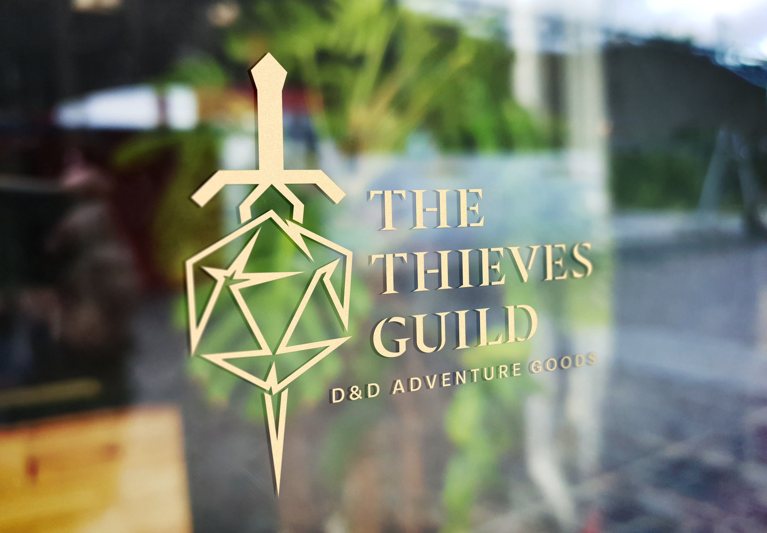
The final design effectively merges the legacy of what is Rogues Gallery into the brand new high-stakes, professional atmosphere of The Thieves Guild, a D&D Adventure Goods supplier. It marks a complete evolution from the 2010 comic shop aesthetic to a brand that prioritizes precision and sophistication.
The Thieves Guild project was designed to feel like more than just a temporary hideout; it represents a fully established organization with deep-root connections across the tabletop world. By moving away from the Rogues Gallery comic theme, the branding focuses on a professional and prestige structure. The result is a cohesive lifestyle brand that feels tactile and permanent, offering sophistication for players who value depth and influence in their adventures.