

Vans Warped Tour 2025 – Conceptual Branding
THE CHALLENGE: The primary hurdle was sanitizing modern festival branding. As major music events shift toward minimalist, safe, and ultra‑clean digital aesthetics, they often strip away the personality of the subcultures they represent. For a legacy brand like the Vans Warped Tour, a clean, corporate look would feel like a betrayal of its roots. The challenge was to create a professional, scalable identity that didn’t look like it was designed in a boardroom, but rather ripped from a wall in an alleyway.
THE OBJECTIVE: My goal was to develop a cohesive visual system for the 2025 tour that honors punk’s analog history while meeting the digital demands of a modern festival.
MOODBOARD
Warped Tour was more than a concert—it was a traveling circus of alternative culture. This mood board synthesizes the historic “Pop Punks Not Dead” with contemporary street style. By integrating iconic punk imagery with modern graphic treatments, the design language fuses the tour’s ’90s roots with its lasting impact on modern streetwear and digital art.
SKETCHES
I explored four distinct typographic directions, each drawing from a different corner of punk subculture. The aim was to move beyond a single logo and forge a flexible identity that feels inseparable from the music itself. These sketches guarantee that the final brand retains a human, imperfect quality, balancing legibility with the chaotic energy of the pit.
DIGITAL DRAFTS ROUND 1
In the first round of digital drafts, the focus shifted to translating the hand drawn energy into a scalable brand system. I explored two polarizing color stories to see how the tour’s identity could adapt to different mediums. I developed two concepts to interrogate the duality of the Warped Tour brand, one representing its aggressive underground origins and the other capturing its vibrant, mainstream cultural peak.
DIGITAL DRAFTS ROUND 2
Moving into round 2, the primary goal was to create a comprehensive and functional design system while preserving the energy of the initial sketches. Feedback from the previous round focused on defining two scalable visual paths, each catering to a different segment of the tour audience. The decision to present these two final directions highlights the flexibility of the proposed system. One is built for maximum impact on digital platforms and large format printing. The other is engineered for merchandising and brand partnerships, demonstrating a high‑level understanding of how a large‑scale festival brand must operate in the real world.
FINAL DESIGNS
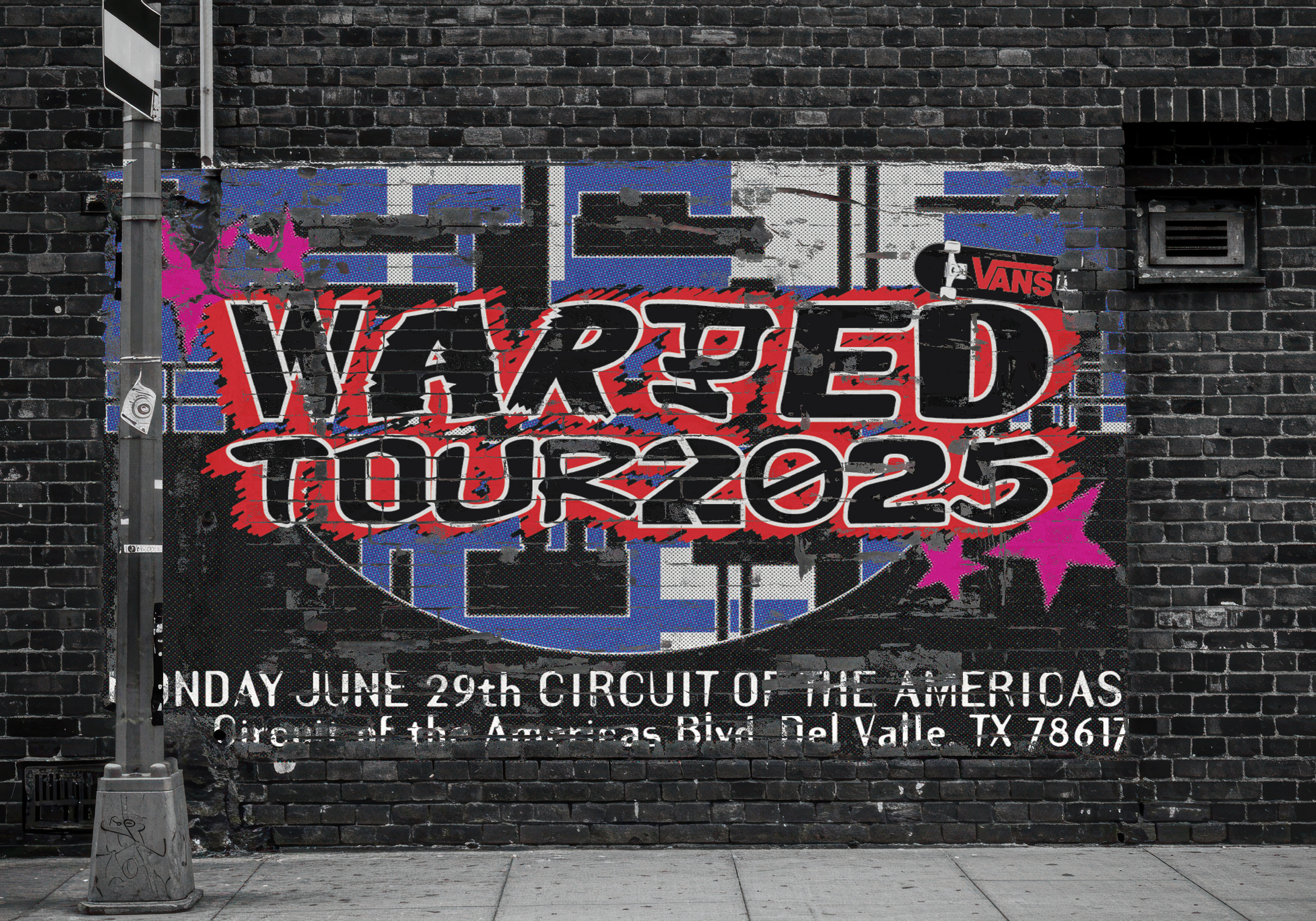
The final visual identity for Warped Tour 2025 is an intentional departure from the overly sanitized aesthetics of modern festival branding. By prioritizing high‑contrast textures, misregistered print effects, and custom distorted typography, the project reclaims the DIY spirit that defined the tour for over two decades. The results serve both as a tribute to the scene’s history and as a functional blueprint for its future.
This project proves that you can scale a major brand without losing the gritty, hand‑crafted soul that made it a movement in the first place.